This was an unbelievable project to work on.
Believe it or not, my work has ended up on the side of a semi-truck once before (at some point I'll get around to writing about that), so when owners Michael & Esther of Arctic Fox Logistics came calling a second time, I was all ears. It had been five years since our first truck, and I was game for round two.
Our first truck had been an epic western scene of a team of horses pulling an old, pioneer wagon through the red hills of a Sedona landscape. The colours were saturated and dramatic. This second truck, though, was going to be different.
We set up a call to discuss their vision, and it was immediately obvious that this truck was going to be much more in-depth. A lot more upfront planning and consultation would be needed. I was excited.
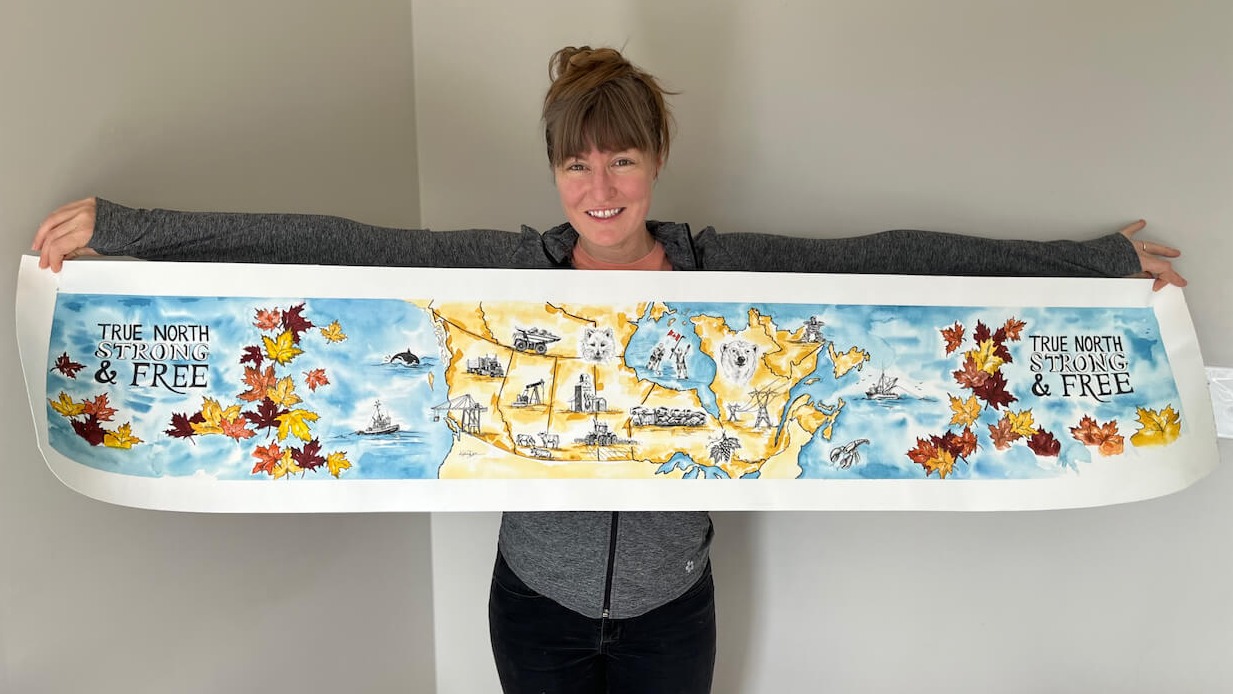
What they wanted was a map of Canada. The obvious and immediate conundrum, as they knew, was the ratio; if only Canada was solely made up of Saskatchewan, tipped over on its side, the near perfect shape of the elongated rectangle of a semi trailer. But alas. Canada in no way fits the ratio of a truck trailer, so the problem was real. I said I would do some mock-ups.
In the event that the map was possible, they also wanted different scenes scattered throughout, representative icons of the provinces and territories. But not the tourist icons one might expect, like Niagara Falls, the CN Tower, or Parliament. What they wanted were industries represented; the major industries of each region, that employ tens of thousands of people. They wanted this truck to represent the backbone of our country, the bulk of the labour force, so that when people looked at it, they would see themselves. They wanted this truck to be an image of unity as it travelled across Canada.
Because Arctic Fox Logistics travels all over North America, literally from coast to coast (in all four directions), they had a good sense of the major industries already. I also wanted to do some research to fill in any gaps, and to get some inspiration for the different icons.
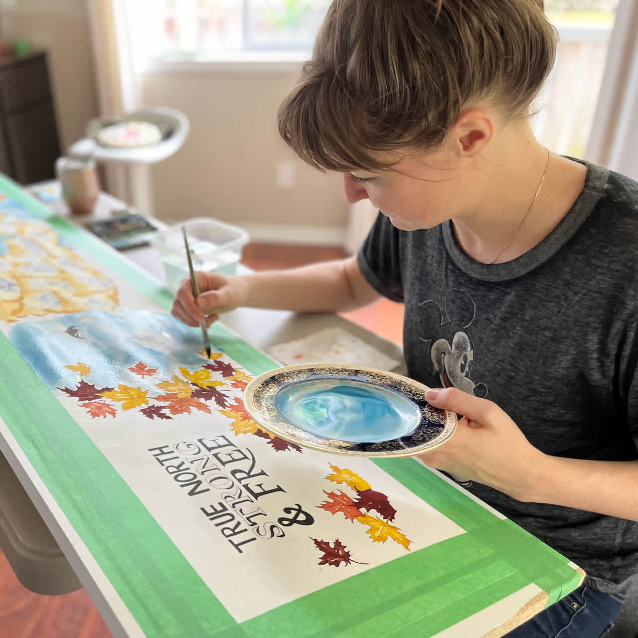
In total we had five consultations, covering off design concepts, initial sketches, colouration, sketch revisions, and typography. And as it's plain to see, we found a way to make the map work, selecting a careful cross section that worked for the truck ratio without compromising the subject matter. That took some figuring for a canvas measuring 10" x 53", but the typography True North Strong & Free, generous oceans, and the maple-leaf frame were all part of the solution.
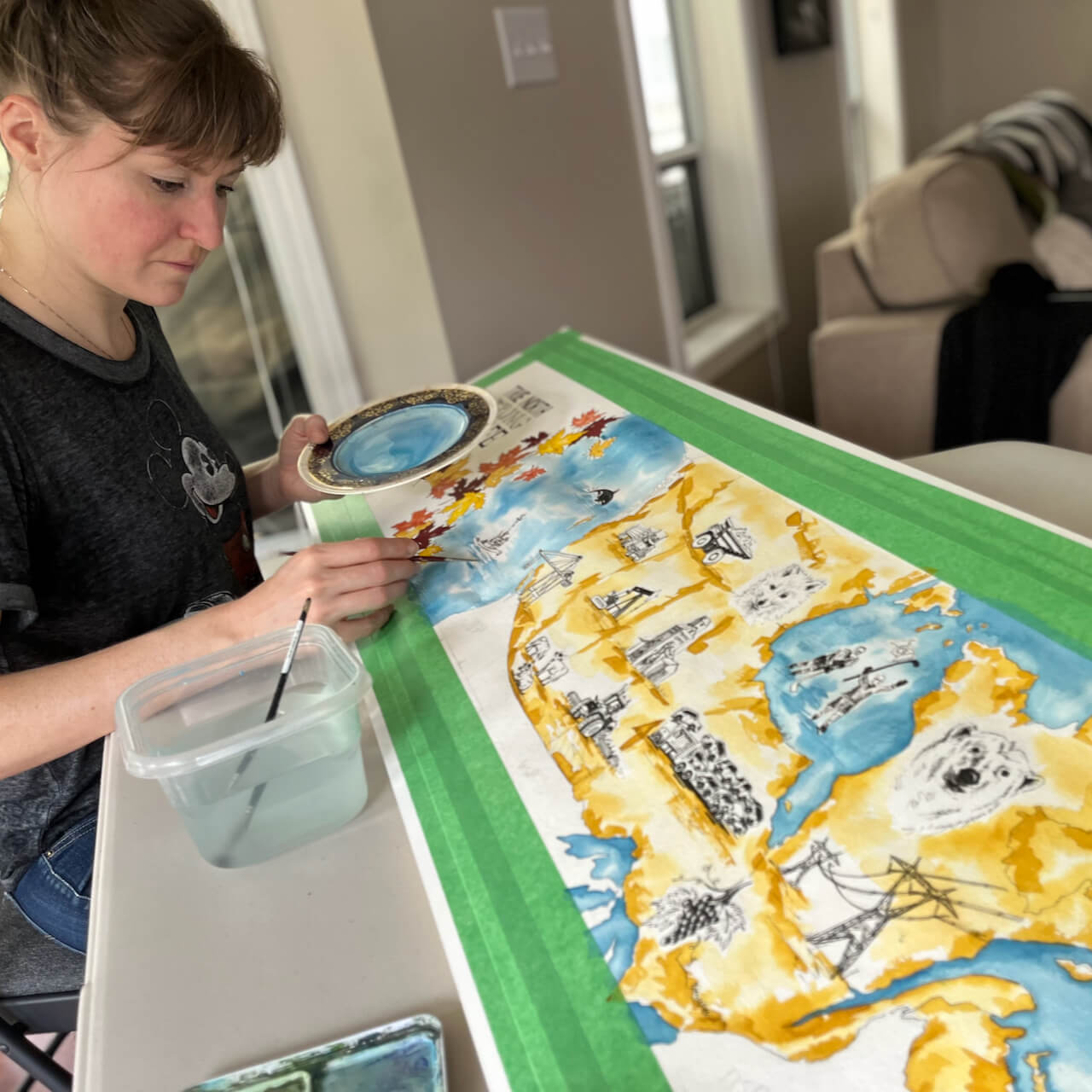
The palette leans into primary colours, with all the regional sketches left as simple black pen strokes (with the exception of the splash on the Canadian flag!) The industries will be obvious to the viewer; agriculture, fishing, forestry, mining, hydroelectricity, oil, farming, and viticulture. The piece recognizes our second official language, with some french words sketched throughout. The painting also acknowledges our indigenous peoples, represented in the inukshuk. Lastly, on a personal note for the company, I sketched an arctic fox in the North West Territories (plus a few other iconic Canadian animals!)
A high resolution scan was taken of the painting, which was then submitted for printing on a vinyl trailer cover. This bad-boy hit the road in 2023 (photos of the finished truck are still coming!)